
Build Maintenance Dashboards
You Can Trust Using Power BI
Turn messy CMMS and Excel data into clear KPI reporting,
so you can explain the numbers with confidence
No waiting for IT. No expensive consultants.
Built for Maintenance Professionals.
People Don’t Want Dashboards. They Want Decisions They Can Trust.
Most maintenance reporting problems don’t start with Power BI.
They start with unclear data, inconsistent KPI definitions, manual spreadsheets, and reports that people look at but don’t act on.
Power BI Quick Start Plus helps you build a practical maintenance dashboard that turns work order data into visibility your team can understand and use.
Sound familiar?
You spend hours every week pulling data from your CMMS, copying it into Excel, wrestling with formulas, and hoping nothing breaks before you hit send.
And when someone challenges the numbers, you need more than a spreadsheet that “should be right.” You need reporting you can explain with confidence.
Your boss wants a dashboard. IT has a six-month backlog. Consultants cost too much. And generic Power BI developers still need you to explain every maintenance detail before they can build anything useful.
You know Power BI could help. Everyone’s talking about it.
But the courses you’ve seen teach you how to analyse coffee shop sales or camping equipment inventory. Nothing about work orders, backlogs, or maintenance KPIs.
Here's what nobody tells you:
Learning Power BI isn’t the same as knowing how to use it for maintenance.
You can master every button and still build dashboards that nobody uses.
That's not a skills problem. That's a strategy problem.
I've been exactly where you are.
I'm Jason — maintenance and reliability professional with 20+ years experience defining KPIs and building reporting and performance management systems.
I've lived the spreadsheet nightmare. I've reported the wrong figures to shareholders and spent sleepless nights fixing the mess. I've watched dashboards I spent weeks building gather dust because they didn't actually help anyone make decisions.
That experience taught me something important:
People Don't Want Dashboards. They Want Better Decisions.
Your boss doesn't care about fancy visuals or clever DAX formulas. They care about knowing what's wrong, what's at risk, and what to do next.
When I finally understood this, everything changed. I stopped trying to learn all of Power BI and focused on the 20% that maintenance professionals actually use. I stopped building dashboards and started building decision support tools.
The results? Dashboards that get used. Questions answered in seconds instead of hours. And a reputation as the person who makes data make sense.
The Path Is Simpler Than You Think.
Step 1: Get Set Up
Access the course, download the resource files, and get your maintenance data ready.
Step 2: Build Your Power BI Dashboard
Follow along as we create a real Maintenance Work Order Dashboard together, step by step.
Step 3: Publish and Use With Confidence
Deploy your dashboard in Power BI Service and start using it to support real maintenance conversations.
No fluff. No irrelevant examples. Just the skills you need to start making an impact.
Ready to Get Started?
Power BI Quick Start Plus takes you from spreadsheet frustration to a live maintenance work order dashboard you can trust, explain, and use with confidence.
Less than a day of consultant fees, with lifetime access and a 90-day guarantee.
$200
Enrol NowA practical way to build the capability yourself, instead of staying dependent on overstretched IT queues or consultancy budgets.
Not Ready to Commit?
Start with my free Power BI Quick Start course. You'll build your first working dashboard in under 90 minutes — no experience required.
Start FreeWhat happens if you don't act?
Another year of manual exports, fragile spreadsheets, and reporting stress. Another year of hoping the numbers are right before someone challenges them. Another year watching more data-literate colleagues get the recognition, promotions, and job security you deserve.
Power BI skills are in massive demand — and that demand is only growing. The question isn't whether you'll need these skills. It's whether you'll have them when it matters.
Imagine This...
It's Monday morning. Your dashboard refreshed automatically over the weekend. Your boss asks about the backlog — you pull it up in three clicks. A colleague wants to know overdue safety-critical work orders by area — you show them in seconds. And when someone asks where the number came from, you can explain it without panic.
People start coming to you. "How did you build that?" "Can you help me with something similar?"
You're no longer the person stuck in spreadsheets. You're the person who helps the team see what's actually going on — and what to do about it.
That's not years away. That's a few weeks of focused learning.
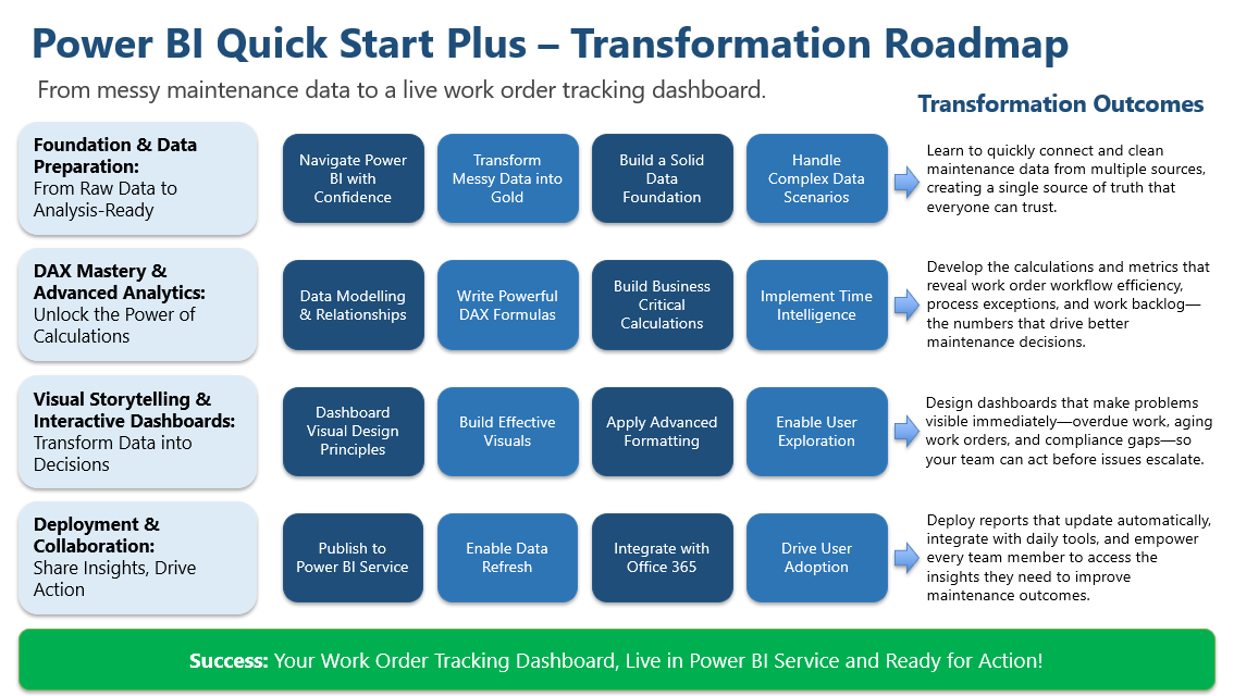
What you'll Master in the Power BI Quick Start Plus
Let's go step-by-step through the modules in Power BI Quick Start Plus and what you'll be able to do after you've gone through each one...
Module 1 — Foundation & Data Preparation
- You’ll learn: to connect messy maintenance data, clean it, standardise it, and load it the right way.
- You’ll be able to: create a single, trusted dataset you can build on—no more Excel spaghetti.
- Payoff: sleep easy at night with the confidence that your numbers are right.
Module 2 — DAX Mastery & Advanced Analytics
- You’ll learn: to build a proper data model, write the calculations that power maintenance KPIs, normalise your metrics using percentages, and track performance across different time periods.
- You’ll be able to: calculate workflow efficiency, backlog metrics, compliance rates, and work order age — accurately and automatically.
- Payoff: a trusted and standardised set of Maintenance KPIs and metrics, ready to turn into a dashboard.
Module 3 — Visual Storytelling & Building an Interactive Dashboard
- You’ll learn: to design clear pages, choose visuals that speak, add drill/filters/tooltips, and highlight exceptions.
- You’ll be able to: build a dashboard people actually use—problems pop, root causes are one click away, and action is obvious.
- Payoff: respect from peers who finally “get it” at a glance.
Module 4 — Deployment & Collaboration
- You’ll learn: to publish to the Service, setup automated data refreshes, package an App, and integrate with Excel, PowerPoint, and Teams.
- You’ll be able to: roll out a living, auto-updating dashboard that fits daily workflows—no IT queue, no stale numbers.
- Payoff: stay in calm control: your reports run themselves and your team trusts them.
Final Outcome!
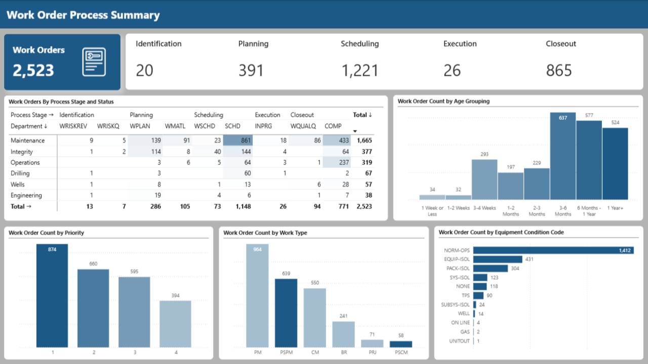
A live Power BI work order tracking dashboard that helps you:
- see overdue and aging work orders
- identify workflow exceptions
- understand backlog and compliance trends
- highlight process issues
- publish and refresh your report in Power BI Service
- support better maintenance conversations
Power BI Quick Start Plus
-
Module 0: Laying out the Foundations: Getting started with Power BI
-
Course Introduction
- What You'll Learn in This Course
- How to Get the Most Out of This Course
-
Setting up the Power BI File
- A Tour of Power BI Desktop: Getting Comfortable with the Interface
- Setting up and Editing a Theme
- File settings
-
-
Module 1: Data Wrangling for Maintenance: From Messy Spreadsheets to Power BI Ready
-
Data Acquisition and Transformation: Connecting to Your Data
- What You'll Learn in Module 1
- Connecting to Your Data
- Navigating the Power Query Editor
-
Transforming Data
- Ensuring Correct Data Types
- Streamlining Your Data: Removing What You Don't Need
- Unpacking Data: Splitting Columns for Better Analysis
- Enrich the Data With New Columns
- Standardising Data: Using Replace Values and Format Case
- Rounding Decimal Places
- Removing Data From Within a String
- Loading the Data Into Power BI
-
Working with Matrix Style Data for Trends
- How to load matrix style data into Power BI - The Proper Way
-
Module Summary
- Module 1 Summary
-
-
Module 2: Unlocking Work Order Metrics: Transforming Data into Knowledge with DAX
-
Elements of a Data Model: Tables, Facts and Dimensions
- What You'll Learn in Module 2
- Elements of a Data Model
- Understanding Your Maintenance Data: Facts and Dimensions
-
Adding a Date and Department Dimension Tables
- Why You Need a Date Table
- Creating a Dynamic Date Table
- Adding the Department Dimension Table
-
Introduction to Relationships
- Connecting the Dots - Understanding Relationships in Power BI
-
DAX Calculated Columns and Measures
- Meet DAX: The Power Behind Your Calculations
- Calculated Columns Measures and Filter Context
- Adding Depth to Your Data - Creating Calculated Columns
- More Calculated Columns - Age and days at current status
- Unlocking Insights - Building Your First Measures
- Adding Age Groupings Sort Dimension
- Adding Work Order Status and Process Stage Dimension
- Days at Current Status Grouping Sort Dimension
-
Creating Work Order Workflow Exception Calculations
- Work Order Workflow Exception Reporting
- Create the Workflow Exception Flags Pt1
- Create the Workflow Exception Flags Pt2
- Create the Workflow Exception Status Calculated Column
- Creating a Workflow Exception Dimension Table
-
Introduction to the CALCULATE() Function
- What is the CALCULATE() Function
- Creating the First Workflow Exception Count Measure
- Creating Remaining Workflow Exception Measures With The Help of AI
- Adding Folders to Organise Measures and Columns
-
Using % to Normalise the Workflow Exceptions
- Simple vs Complex Filters
- Modifying the Filter Context - Introduction to ALL()
- Pct of Process Exceptions Across ALL Work Orders
- Pct of Process Exceptions Across ALL Process Exceptions
- Pct of Process Exceptions Across ALLSELECTED Values in the Visual
- Pct of Process Exceptions by Process Stage ISINSCOPE Pt1
- Pct of Process Exceptions by Process Stage ISINSCOPE Pt2
-
Introduction to Time Intelligence
- What is time Time Intelligence
- Compairing This Week Vs Last Week with DATEADD
- Import Work Orders Completed Data
- Calculating Year-To-Date Cost with Full Version Pt1
- Calculating Year-To-Date Cost with Full Version Pt2
- Calculating Year-To-Date Cost with TOTALYTD Functions
-
Module 2 Summary
- Module 2 Summary
-
-
Module 3: Beyond the Numbers: Crafting a Visual Story with Your Work Order Dashboard
-
Introduction to Data Visualisations
- What You'll Learn in Module 3
- Designing Your Report - Layout and Formatting Essentials
- Visual Design for Reports and Dashboards - Top 5 Rules
- Define the Purpose of the Report
- Using AI To Help Gather Requirements and Ideas
- Remove Clutter - Improve Focus
- Label for Context
- Purposeful Colour
- Data to Decision Journey
- Further UI / UX Reading
-
Building the Workflow Status Page
- Getting Started With The Card Visual
- Card With Multiple Values - Small Multiples
- Card with Multiple Values - Multiple Measures
- Adding Images to a Card
- Adding a Matrix of Work Orders at Each Status / Process Stage
- Exploring Bar and Column Chart Types
- Sorting and Sequencing Columns
- Configuration and Formatting Columns Charts
- Exploring Different Screen Area Sizes
- Adding More Bar and Column Chart Visuals
- Using Colour to Guide Attention
- Modifying Column Spacing to Create a Distribution Effect
- Setting Spacing and Alignment of Visuals
-
Building Workflow Exception Overview Page
- Recap on Workflow Process Exceptions Calculations
- Adding a Card with Multiple Measures
- Adding a Pie Chart Visual of Process Compliant vs Non-Compliant Work Orders
- Creating a Workflow Exception Matrix
- Updating the Column and Bar Chart Colours
- Table Visual Deep Dive - Adding Workflow Exception Details
-
Adding Trends and Spark Lines
- Recap on the Workflow Process Exception Trend Data Model
- Getting Started with Line Charts
- Using Shaded Areas Under a Line Graph
- Using Series Labels on Multiple Categories
- Adding Trend Lines
- Adding and Configuring Forecast Lines
- Using Reference Lines for Context and Story Telling
- Lines Graphs vs Column vs Stepped Lines
- Adding Small Multiples to Line and Column Charts
- Sparklines Pt1 - Set-up Data Model and Add Sparklines
- Sparklines Pt2 - Fault Finding and Fixing Blank Values in the Matrix
- Sparklines Pt3 - Configuring the Layout of Sparklines
- Two Approaches to Analysing Pct Process Exceptions
- Setting Up Visuals With Process Exceptions Calculations
-
Adding Interactivity with Cross Filters, Filters and Slicers
- Cross Filtering - Setting Up Interactions Between Visuals
- Filters and the Filter Pane
- Configuration Settings and Formatting Filter Pane
- Introduction to Slicers
- Slicer Option 2: Button Slicer
- Slicer Option 3: List Slicer for Always on Selection Options
- Slicer Option 4: Text Slicers
- Buttons to Apply and Clear All Slicers
-
Enhancing Reports with Tooltips
- Setting Up Standard Tooltips
- Designing Custom Tooltip Pages
-
Drilldown and Drillthrough
- Drill Down and Drill Up a Hierarchy on a Visual
- Setting up a Drill Through to a Work Order Details Page
-
Enhancing Visuals with Conditional Formatting
- Heatmap for Matrix
- Heatmap for Tables
- Conditional Formatting with Rules
- Using Data Bars In Tables
- Using Data Bars on a Matrix
- Creating Mini Bar Charts with Data Bars in Tables
- Using Icons for Conditional Formatting Thresholds
-
Using Measures for Defining Conditional Formatting Rules
- Using Field Value Option to Set Work Order BG and Font Colour
- Using Measures to Add Conditional Formatting to Cards
- Using Measures to Add Icons
- Adding the Number of Records Showing to the Table Header
- Driving a Threshold Line with a Numeric Parameter for What If Analysis
- Adding Reference Labels to List Slicers
-
Card Reference Labels Master Class
- Adding Reference Labels for Target and Difference From Target
- Adding Reference Labels for Target and Difference From Target Pt2
-
Adding Specific Labels to Column Charts
- Adding Custom Labels to Column Charts - % and Count
- Adding Details Labels to Column Charts
-
Using Bookmarks and Field Parameters
- Using Bookmarks for Filters and Slicers
- Using Bookmarks to Toggle Visuals Displayed
- Using Field Parameters to Toggle Measures on a Visual
- Using Field Parameters to Toggle Categories on a Visual
-
Adding Action Buttons
- Button Actions
- Setting Up a Drillthrough Button
- Adding a Page Navigator Button
-
Module 3 Summary
- Module 3 Summary
-
-
Module 4: Collaboration in Action: Sharing Your Dashboard and Building a Foundation for a Data-Driven Team
-
Publishing to the Power BI Service & Setting Up Apps
- What You'll Learn in Module 4
- Understanding the Structure of the Power BI Service
- A Tour of The Power BI Service
- My Workspace Explained
- Pre-publishing Checklist
- Creating a New Workspace and Publishing a Report
- Setting Up Your App
- Adding Reports to an App
- Adding Links and Sections to Apps
- Adding Icons to Reports and Sections
-
Key Features of The Power BI Service
- Personal Bookmarks and Filter Reset Button
- Personalising Visuals
- Setting up Automated Email Subscriptions
- Favourites, Screen Options, Comments and Info Button
- Embedding Power BI Reports into Teams
-
Exporting Data
- Exporting Data to Excel
- Exporting Data to Excel with Live Connection
- Analyse Power BI Data In Excel - Live Connection
- Adding a Connection to Power BI From Within Excel
-
Integrating Power BI with PowerPoint
- Exporting to PowerPoint
- Embedding Power BI into PowerPoint
-
Data Refreshes - Keeping Your Data Up-to-Date
- Refreshing Data in Published Reports
- Debugging Common Refresh Failures
- Downloading a Published PBIX File
-
Finishing Touches
- Choosing the Final Report Pages
- Setting Conditional Formatting
- 3 Ways to Add Help to Your Reports
- Publishing the Final Report
-
Module 4 Summary
- Module 4 Summary
-
Course Summary and Next Steps
- Course Summary
- Recommended Next Steps and Additional Resources
-
Is This Course Right for You?
This is for you if you are a:
- Maintenance Manager who needs clearer KPI visibility
- Maintenance Analyst building reports and dashboards
- Reliability or Maintenance Engineer working with asset and work order data
- Supervisor or Planner who wants better execution visibility
- Maintenance professional tired of generic Power BI examples
This course is NOT for you if:
- You want someone to build a custom dashboard for you
- You expect perfect dashboards without working through the lessons
- You need enterprise BI architecture or data warehouse design
This course focuses on the 20% of Power BI that maintenance professionals use 80% of the time. If you want to make an impact fast, that's exactly what you need.
Why This Is Different From Generic Power BI Training
- Built around maintenance work order data
- Focused on the Power BI skills maintenance professionals actually use
- Shows how to move from data to decisions
- Helps you build something practical, not just learn features
- Designed for people who need progress without waiting on IT or consultants
Frequently Asked Questions
I'm really busy, how much time will it take to learn Power BI?
What previous IT skills do I need?
How hard is it to learn Power BI?
I can learn Power BI on Youtube.com for free, why should I sign up to this programme?
Do I need to have an IT background or know how to code?
Is it worth the time and effort to learn Power BI?
Is the course only for maintenance and reliability professionals?
What if the course isn't right for me?
Will this work if my data is messy?
Ready to Get Started?
Power BI Quick Start Plus takes you from zero (or frustrated) to confident — building dashboards that actually help your team make better decisions.
Less than a day of consultant fees, with lifetime access and a 90-day guarantee.
$200
Enrol NowNot Ready to Commit?
Start with my free Power BI Quick Start course. You'll build your first working dashboard in under 90 minutes — no experience required.
Start Free