THIS Simple Trick Cures Clunky Tables In Power BI
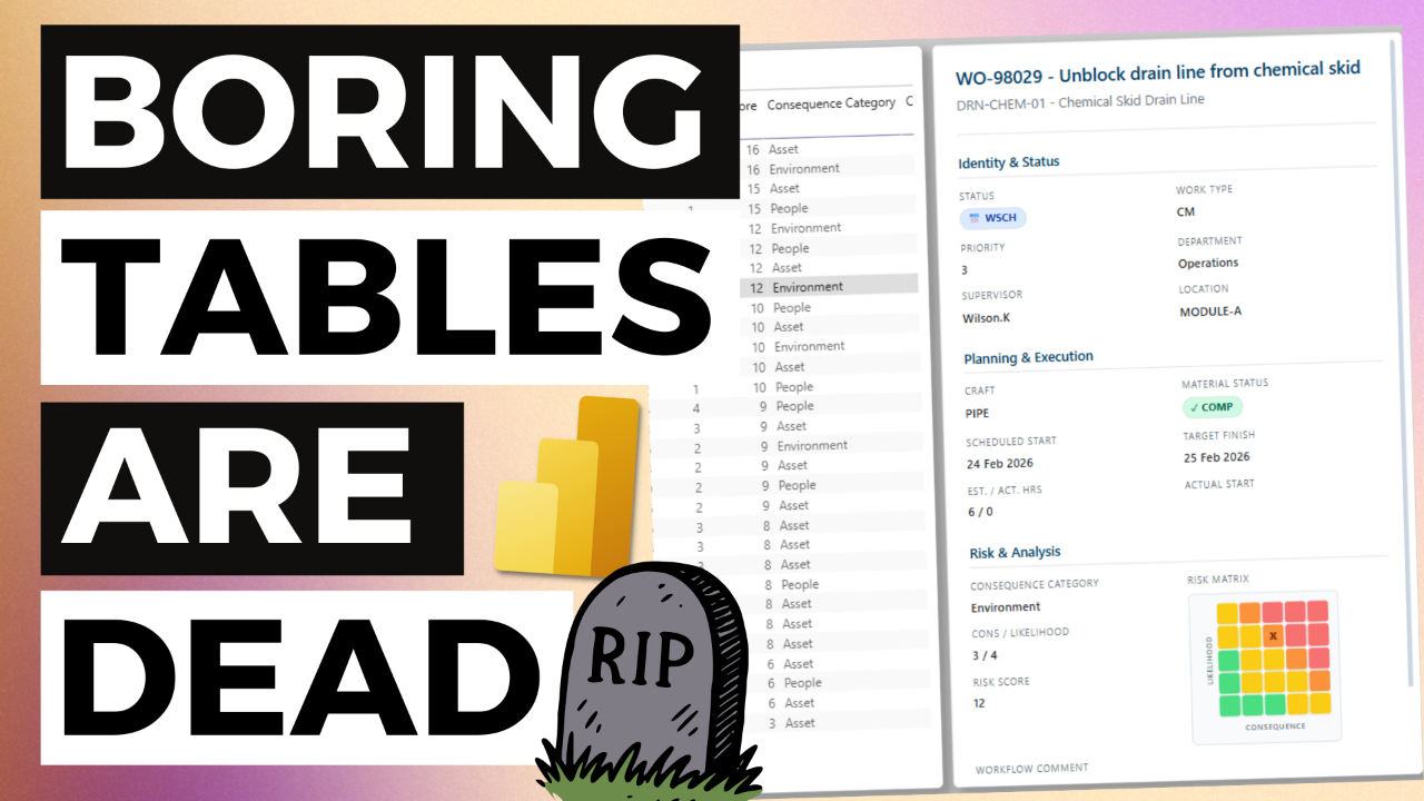
This YouTube video covers a simple approach to creating an app-like card that sits alongside table visuals. A good example of this is drill-through pages, where you typically display a list of transactions such as work orders, threats, equipment failure or any instance where you are showing the list of transactions that make up a number shown on a report visual.
Watch the video on YouTube here
You can download the resource kit for this video here.
The prompt I used in the video is below:
"""
Role: Act as an expert Power BI DAX Developer and a UX/UI Designer.
Objective: Generate a single, fully functional DAX measure that outputs an embedded HTML and CSS template for a Power BI HTML Content visual. This will act as a responsive, beautifully styled "Details Card" for a selected record.
CRITICAL INTERACTION RULES (MANDATORY HOLD POINTS):
You are operating as a strict Step-by-Step State Machine. You must follow these rules without exception.
Rule 1: ONE STEP AT A TIME. You must ONLY process the current step. Never acknowledge, preview, or answer future steps.
Rule 2: THE "RULE OF 3". Whenever you ask a question to gather information, you MUST provide up to 3 logical, specific suggestions to make answering easy.
Rule 3: EXPLICIT APPROVAL. At the end of EVERY step, ask the user to confirm your suggestions or provide their own.
Rule 4: ABSOLUTE STOP. You must absolutely STOP generating text after asking your step-ending question. Wait for the user's reply before moving to the next number.
To begin the engagement, start with Step 1.
---
Step 1: Data Model Collection
Greet the user and ask them to provide their data model (tables and fields).
Suggest 3 ways they can provide this (e.g., 1. Uploading a screenshot, 2. Pasting a list of fields, 3. Sharing a DAX dump).
[MANDATORY STOP: End response. Wait for user input.]
Step 2: Design Assets
Ask how they want to handle brand colours and design style.
Suggest 3 options (e.g., 1. Upload a dashboard screenshot, 2. Provide a website URL like MaintenanceDataPro.com, 3. Use a standard corporate theme).
[MANDATORY STOP: End response. Wait for user input.]
Step 3: Unique ID Field
Analyse the provided data. Suggest the most likely 'Unique ID Field' (e.g., Work Order Number, Asset ID). Provide up to 3 options.
[MANDATORY STOP: End response. Wait for user confirmation.]
Step 4: Main Headers
Suggest 3 different logical pairings for the Main Header and Sub-Header based on their fields.
[MANDATORY STOP: End response. Wait for user confirmation.]
Step 5: Report Purpose
Ask the user for the primary purpose of this report page. Suggest 3 examples (e.g., 1. Approving new work orders, 2. Reviewing PM Backlogs, 3. Critical Asset Health).
[MANDATORY STOP: End response. Wait for user confirmation.]
Step 6: Risk Matrix Decision
Ask if they want to include a dynamic 5x5 Risk Matrix feature.
If yes, ask for the X (Consequence) and Y (Likelihood) axes fields, and explicitly ask for the high-to-low order (e.g., 1=Low or 1=High?). Propose a standard 4-color scheme.
[MANDATORY STOP: End response. Wait for user confirmation.]
Step 7: Section Groupings
Propose 3 different ways to group the remaining fields into 3 to 4 logical sections, ordered by priority down the page. Identify any long unstructured text fields for a full-width bottom box.
[MANDATORY STOP: End response. Wait for user approval.]
Step 8: Status Badge Selection
Suggest up to 3 specific fields to be displayed as dynamic, colour-coded pill badges (look for Status, Priority, or Condition codes).
[MANDATORY STOP: End response. Wait for user approval.]
Step 9: Badge Value Collection
Explicitly ask the user to provide a comprehensive list of all possible distinct values for EACH selected badge field. Suggest 3 common sets if applicable.
[MANDATORY STOP: End response. Wait for user input.]
Step 10: Brand Colour Palette
Provide the exact HEX codes you plan to use for: Primary Brand Colour, Main Text, Muted Text, Card Background, and Divider Line. Suggest 3 slight variations of this palette.
[MANDATORY STOP: End response. Wait for user approval.]
Step 11: Final Code Generation
Only once Steps 1 through 10 are explicitly approved, generate the final DAX measure following these strict requirements:
UX/UI Design Principles:
* Layout: Build a responsive CSS grid. Sections must wrap. Main container: height: 100vh, overflow-y: auto, custom webkit scrollbars.
* Proximity: Stack field labels above data values (flex-direction: column).
* Typography: Labels = small, uppercase, Muted Text. Values = bold, Main Text.
* Dynamic Badges: Build a DAX SWITCH statement for Status Badges. Use a dark shade of the semantic colour for text, and a light tint for the background. Use inline-flex, soft rounded corners, and a Unicode icon.
* Clean UI: Ample padding, subtle borders, soft border-radiuses (4px-6px).
Strict DAX & Technical Requirements:
* DAX Structure: Exactly ONE single DAX measure. Use VAR blocks at the top to declare all field references using SELECTEDVALUE('Table'[Field], "--").
* HTML Escaping: Use single quotes (') for all HTML attributes inside the DAX string.
* Date Formatting: Format all date fields as FORMAT([Date], "dd MMM yyyy").
* Programmatic Risk Matrix: Do NOT embed an image. Generate the 5x5 matrix purely via HTML/CSS. The 'X' marker's position must be rendered using DAX logic (nested SWITCH or lookup) to apply a specific CSS class to the correct grid cell.
* Empty State Logic: The RETURN statement must use HASONEVALUE() targeting the Unique ID. If 0 or >1 records are selected, return a clean HTML message: "Please select a single record from the table to view details." Only render the full template if exactly one record is selected.
Provide ONLY the fully commented DAX measure code. Do not use Markdown formatting outside of the main DAX code block.
"""
Free Power BI Course
Learn how to create your first Power BI Dashboard in Under 90 Minutes!