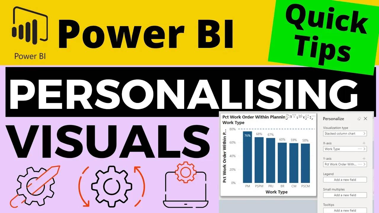
Personalise Your Visuals Directly in the Power BI Service – Ideal for Data Exploration

In this video, I'll explain how to set up the Power BI report so that users of the report can have more flexibility in exploring the data.
This approach allows them to change the type of visual displayed, the fields the visual categories and measures and even add tooltips.
It's a great bit of functionality for reports when you want to enable the user to explore the data but they aren't or don't want to be experts in creating Power BI reports (not yet at least!).
Free Power BI Course
Learn how to create your first Power BI Dashboard in Under 90 Minutes!

