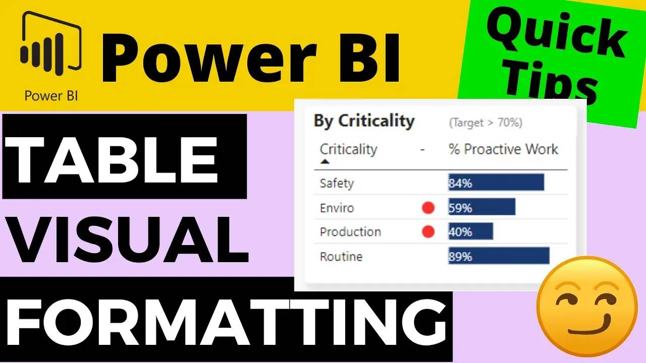
Neat Idea For Adding Conditional Formatting Alternative to DATA BARS in Power BI TABLE VISUAL

In this short video, I'll explain my solution to add conditional formatting to data bars on a table visual in Power BI.
The standard functionality in a Power BI table visual allows you to add a data bar that represents the relative value displayed in the table cell. You can select the colour of the bar, but can't link this colour to a condition (with the expectation of choosing a different colour for negative and positive values).
In this solution, I explain how to add a red dot indicator next to the bar to indicate values that are outwith a given target threshold. This allows you to quickly draw the viewer's attention to the value that they need to investigate.
Free Power BI Course
Learn how to create your first Power BI Dashboard in Under 90 Minutes!

